Product news
New Dashboard Features: Reporting and Charts
Check out the awesome features we have rolled out in 2016.

January 6, 2017
The Hologram team wrapped up 2016 with a batch of new features. Below is a run down of the most recent updates.
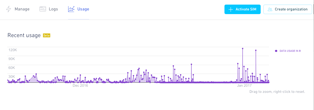
Recent usage chart
This Recent usage chart shows data session from all your devices over the past few months. You're also able to: Zoom in on specific busy days if the wide view isn't clear enough for you, and a filter to limit which devices are included in the reports.
If you want to view the details for an individual data point, you can hover on the circle to see the device name and the exact number of bytes used.
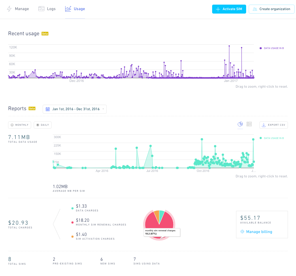
Reports
The Reports section provides more flexible and extensive information on your devices' data usage and account balance charges. This is broken into three sections: Usage, Charges, and SIM Count.
Usage Reporting
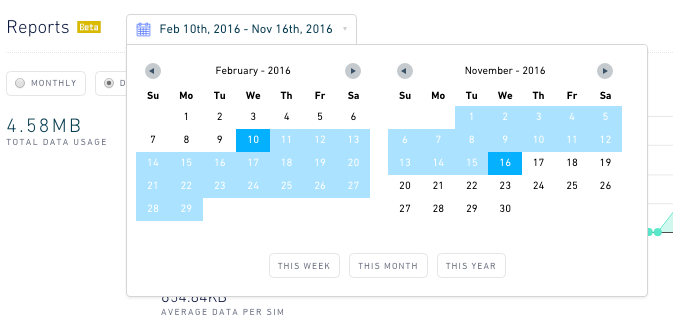
One of these upgrades we're particularly excited about is a new Usage view in our Dashboard. This section allows for visualizations and exportable data reports, along with some extra aggregate information about your data usage. The customizable features in this section include: Date Selection: These two calendars allow you to customize the start and end date for all the data below.
Frequency (Monthly and Daily): Choose whether the usage data points on the graph are grouped by day or month within your date range. Chart or Table: Toggle between a time series graph or a historical table with the devices, dates, and data used.
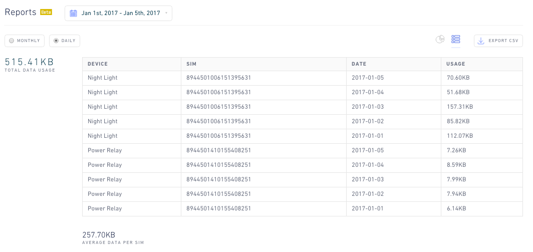
CSV Export: In the top right of this section, the "Export CSV" button will download a copy of the data in the Table View to your local computer!Additionally, on the left side of the page, you'll see two numbers:
- Total Data Usage: The amount of data used by your devices (which can be filtered out by device tag) during the time frame you've selected.
- Average Data Per SIM: The above number divided by the total number of devices who used data.
Charges
This pie chart provides a visual split of the primary charges you'll have on your account:
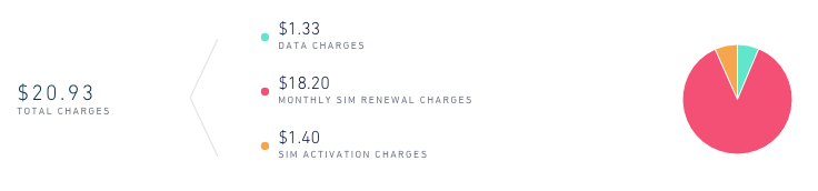
- Data Charges - The cost of the data you've used in the time frame you've selected.
- SIM Activations - Charges taken for activating new SIMs.
- Monthly SIM Renewals - The monthly charge for your SIMs.
SIM count
This last section gives a quick summary of all the SIMs your organization has or had during the time frame you selected.
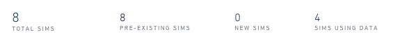
- Pre-Existing SIMs: The number of SIMs live prior to your selected time frame.
- New SIMs: Devices activated during this time frame.
- Total SIMs: The total number of devices you have. This is also the above two numbers added together.
- SIMs Using Data: How many of your devices actually used data during the selected time frame.
Future Plans
We at Hologram are constantly working to improve all aspects of our platform.