Product news
Still lookin' Stellar
Reflecting on a year with the Stellar Design System, what we've learned, and where we plan on going.

July 15, 2020
To the stars
One year ago, Hologram launched the Stellar Design System (/blog/lookin-stellar)—a cohesive collection of components and visual design paradigms designed to make the Hologram Dashboard a delight to use. Stellar was informed by years of user research with our customers to build a better understanding of how IoT teams operate, leading to the Dashboard being designed not just for engineers, but also for folks working in operations, customer success, and finance.
A year in, Stellar continues to grow as we add new functionality to the Dashboard. With the launch of Inflight, we introduced several components to the design system based on the unique needs of these new experiences—like table rows that expand to reveal more contextual information, new navigational elements, and full-screen map experiences.
In parallel to building these new features for customers, we're constantly re-evaluating the design system to remain consistent. So with a year of Stellar behind us, I want to talk about what we're working on next.
Tell me a Story(book)
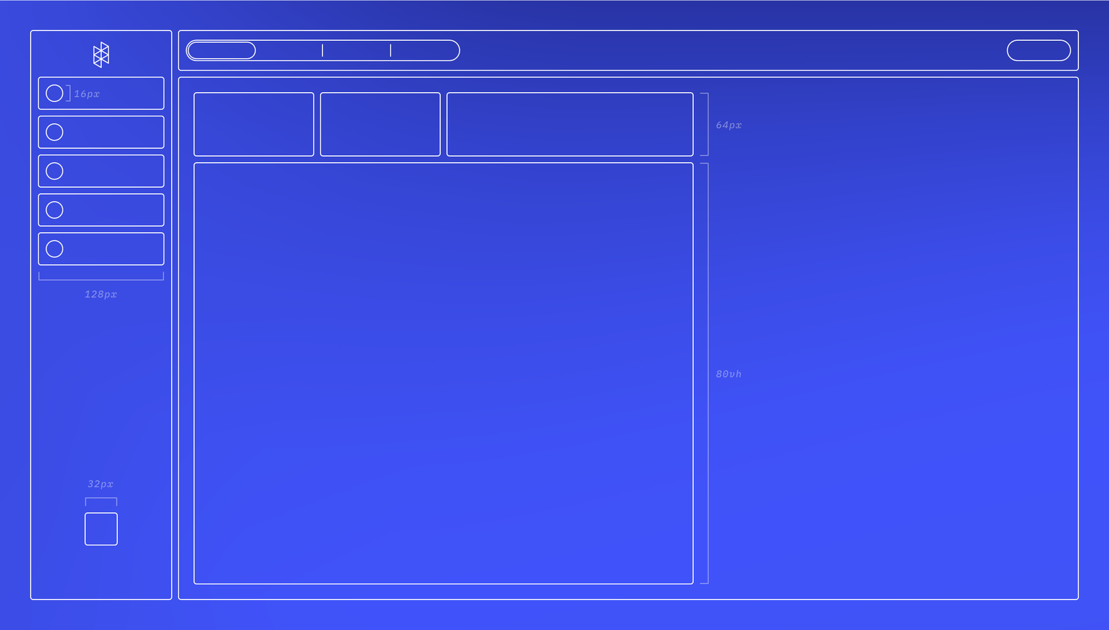
The most comprehensive expression of Stellar exists, perhaps unsurprisingly, within the Design team's toolkit. We use a combination of Sketch (http://sketch.com) and Abstract (http://abstract.com) to design and maintain the design system, mockups and works in progress. The formality of Abstract's version control approach has proven to be an excellent foundation for our Design team to build on. It has the side benefit of resonating with the Engineering team. (Don't @ me about Figma.)
As practically every product team would attest to, the trick is in the handoff. Abstract makes it easy to share Collections of mockups and inspect CSS properties. Still, QAing components in a full environment can sometimes be complicated, so our Engineering team is adopting a tool called Storybook (https://storybook.js.org) to code and maintain production-ready design system components in a single location.
"Our engineering team specifically wanted to harden up the visuals and interactive elements on the Dashboard by creating and carefully honing each component in a UI Kit environment and giving design a hand in that process," Lead Engineer Julie Hiller explains. "This was done particularly well with our icon pipeline, which has been standardized to a set of major, minor, and micro sizes that the design team can then manipulate easily without almost any engineering involvement."
As we migrate Stellar into Storybook, I'm using this opportunity to re-examine some fundamental design infrastructure geared towards accessibility.
Colors and accessibility
One of the first designs to be migrated into the UI Kit was the standard button component. During this process, however, I realized a hard truth: our primary call to action button fails the Web Content Accessibility Guidelines' (WCAG) minimum contrast ratio. (We use a fantastic Sketch plugin from Stark (https://www.getstark.co/index.html) that makes it really easy to check things like this.)
Oops! Our button failing to meet the minimum 4.5:1 contrast ratio.
As we continue to improve the usability of the Hologram Dashboard, accessibility is front-of-mind. In response to these results, we went through the entire color system used in the Dashboard to improve its accessibility and consistency.
Indigo
The indigo hue we use throughout the Dashboard represents positive and actionable moments, so its update needed to retain the same tone. We altered our new indigo a few points darker to improve contrast with white text but increased the saturation, which retained some vibrancy.
That's better. Our button now passes the 4.5:1 contrast text. Higher contrast color pairings like dark text on a white background will easily get us to that AAA rating.
The result is subtle but not inconsequential. That text pairing now hits a 5.4:1 contrast ratio, surpassing the minimum 4.5:1 target.
From that new hue, we derived a palette of fives shades for use in various ways, including hover states and alert background fills.
Grayscale
Once we refined our indigo and cured our contrast blues, it was time to move onto the grayscale palette. A comprehensive grayscale is critical in software design—shades of gray establish hierarchy and draw the eye's attention to essential tasks. Navigational elements are designed with darker shades of gray and exist in the Dashboard's periphery so your concentration can remain on the task at hand. Lighter shades backdrop the application and allow information cards to pop into focus.
Since the primary accent color in the Dashboard is indigo, our grayscale incorporates cooler hues, so the entire color system feels balanced. Cooler colors feel modern and fresh compared to their warm counterparts, so it's an attractive choice for interfaces. A couple of our legacy grays did lean on the warmer side, so we adjusted for consistency as we expanded the palette.
Bringing it all together
These decisions made with our brand indigo and the grayscale influenced the remaining colors. Eagle-eyed readers might notice that each palette has a dedicated dark text color with a compatible tint. When used together, these pairings improve color blending and legibility.
What's in a name?
Aside from improvements to accessibility and consistency, this was a perfect opportunity to take stock of the colors we deployed. Every hue in our new color system was assigned a unique name to ensure parity between our design tools and the values our front-end engineers are referencing. By removing small barriers like this, we simplify the QA process and deliver functionality to our customers even faster.
Why does this matter?
These changes may be small, but they're not insignificant. The Hologram Design team is dedicated to providing the best product experience for all of our customers worldwide. Our work should be inclusive to the estimated 2.2 billion people globally who live with vision impairment or blindness.
We think it's the right thing to do, so finding the time to do it was easy. That's not to say that we're done, though. We have many usability and accessibility-minded updates coming down the pipe that I'm excited to give a small sneak peek of.
Getting around the Dashboard
With the new color system established, the work of applying those new standards throughout the Dashboard begins. And just because your data takes center stage doesn't mean we're not going to give our navigational components some attention.
Global Siderail
To kick things off, we increased the contrast of our Global Siderail's button states and improved control visibility. The selected tab (rendered in our new indigo) is offset from the edges so as not to interfere with neighboring content. Additionally, we refreshed the iconography for better clarity and better consistency with icon styles used elsewhere in the Dashboard.
Oh, and the logo got a little smaller, too. Don't tell our marketing team.
Page Navigation
Perhaps the most apparent change, the Page Navigation, was given a darker appearance to further set it apart from the main content. We rounded off the corners completely to visually differentiate navigational controls from other interactive components and added vertical dividers between the segments. Doing so makes each item is quicker to parse and have a more clear clickable area.
Deep Nav
Like the Page Navigation, our Deep Nav (really, it's a segmented controller that lives deep on a page, but we like to have fun here) evolved to feature a rounded design and vertical dividers. We also shrank the font size slightly to improve content hierarchy and the vertical rhythm of the page.
New paradigms with Inflight
We don't introduce new functionality lightly, but sometimes customer needs can only be met with a fresh approach. This is how we arrived at one of the core UX patterns for our new Inflight tool.
Hologram Inflight is a new proactive alerting tool that provides greater visibility and real-time alerting on device usage and behavior changes. We present these events using a standard table view to present as many alerts as possible. With a single click, each row can expand inline to expose more information about an event without sending a customer to a new page or covering useful context with a floating modal.
What's next
That's just a small look at what we've been building. The Hologram Design team is always working to make the Dashboard even more useful. In time, you'll see these updates and more coming to your Dashboard.